My take on the 'Dumb Phone' movement
Spend any time on social media, YouTube especially, and you are likely to be presented with something with a title like How to Dumb-ify Your Phone and Get Your Life Back or I turned my iPhone into a dumb phone and you should too in which people talk about how they have regressed their smartphones back to something that’s supposed to feel like using a Nokia 3210, all in the name of reducing distractions or breaking the addiction to the smartphone.
Now, don’t get me wrong, I’m all for reducing the reliance on one’s smartphone. I’m as guilty as the next person of having spent too much time doomscrolling through social media or obsessively checking for updates every 30 seconds. Anything that can help break that cycle is a good thing.
One common feature of these videos or articles, along with deleting nearly all the apps off the device, is to use something like Blank Spaces to replace the usual icons with descriptive text labels in order to make things less enticing.

I seriously considered giving this a go, but the number of apps that I use regular is perhaps on the higher side, so I looked for other options.
I’ve actually had a fairly minimalist setup on my iPhone for quite some time, inspired by a combination of a video from Peter McKinnon and reading Digital Minimalism by Cal Newport.

It consisted of a single Home Screen featuring a single widget stack (calendar, reminders, batteries) and a single folder of regularly used apps, 18 in total) in the Dock. Everything else was in the App Library and could be searched for if required. The background was designed to make the dock fade in to it when in Dark mode, so that it looked like there was just the folder there. All icon labels were turned off. The above screenshot shows the addition of Discord to the Home Screen. This was because Discord was the designated communication platform for an event I was volunteering at. I put it there for ease of access during the event and removed it, and deleted the app from my phone, immediately after the event was over.
This minimalist design was combined with making use of the Focus Modes (introduced in iOS 15) to control notifications and interruptions, along with turning off some notification indicators, especially the little red badges for most apps. I’d been making use of Do Not Disturb to effectively shut my phone down overnight, but with the additional features introduced through iOS 18, I refined things further, limiting who and what can grab my attention during the work day, at evenings and weekends, and after 9pm. I’ve found notifications triggering, ever since the blinking LED of a BlackBerry ruled my life, and now, with very few exceptions, nothing in my life is that urgent that it can’t go unattended for a little while. And, if required, I can always temporarily switch off the Focus Mode to handle a particular situation.
This setup has been working well for 3 years. But iOS 26 introduced some new design elements that actually made it a little harder to “hide” the Dock, and that, combined with the itch to change things up a little, had me thinking of what to tweak. Then I came across a video on YouTube, iOS 26: My Home Screen Setup!, that sowed the germ of an idea. A little bit of trial and error and I now have a new setup.
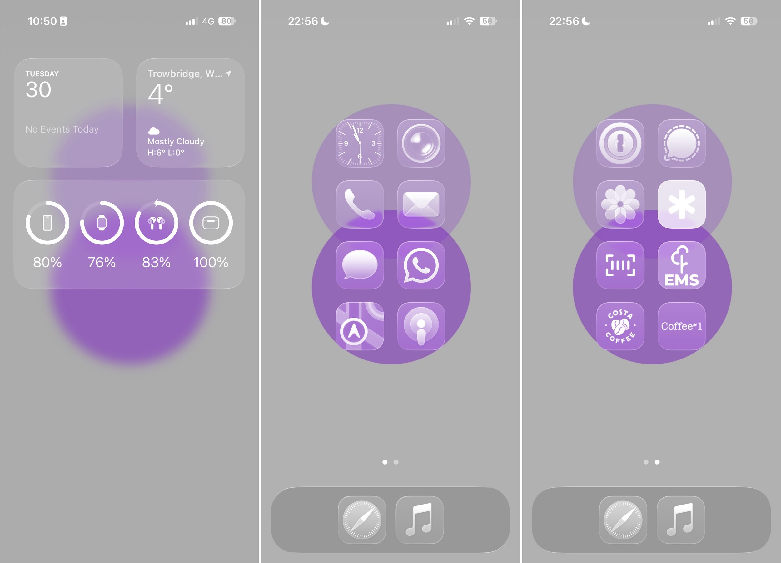
The key element is the use of iOS 26’s Tinted Icons feature, which can remove all the colour from the app icons, whilst still allowing the apps to work in colour. One of the common tweaks to make a phone less appealing is to turn it greyscale, which is great, accept it can affect the apps as well, and that doesn’t really work with things like Maps (where colour is used to indicate traffic conditions) and Photos. Removing the colour from the icons is a good compromise, for me at least.
Widgets have been moved to the dedicated widgets screen, as it turned out I didn’t really scroll through the Smart Stack that often, and a single swipe brings everything in to view when required.
The main setup is now two screens of app icons, 2 columns, 8 icons per screen, with 2 additional icons in the dock. For now the latter two are Safari and Music, but that might change with time. For now I think I have the right apps where I need them.
This might look more cluttered, but in actual fact it results in less swipes and taps. Instead of having to open a folder and then find the application I want, my most commonly used apps, mainly communication ones, are on the first screen, and one swipe brings up the less regularly used ones. And again, everything else is in the App Library, with some apps added to the Hidden folder, so they take extra effort to access. Periodically I go through my app list and look for ones iOS has offloaded and delete those if I really don’t need them (this regularly happens to parking apps, but I like to have those installed, rather than trying to re-download them when I need them to pay for parking), along with any other I realise I haven’t used in quite some time or don’t really need.
All of this, with the addition of using a pocket notebook to Bullet Journal (more on that in another post), hopefully means that I will spend less time on my phone and more time focused on other activities.
Further Reading
If you’d like to read up more on how our digital world might be affecting our attention, cognitive abilities and even our energy levels, I would heartedly recommend the following books:
- Stolen Focus by Johann Hari
- The Shallows by Nicholas Carr
- The Tao of Digital Minimalism by Oudam Em